 author
Massive hospitals and major banks face a common challenge. Guests frequently struggle to find their next destination. Medical facilities typically distribute registration, imaging, wards, pharmacies, and emergency services across multiple levels. Meanwhile, a bank branch features cash counters, customer service rooms, loan offices, and self-service zones.
Physical maps and static signage offer rudimentary assistance. However, these tools fail to adapt swiftly. Departments relocate, and corridors shut down. Digital wayfinding solves this. It displays maps, directions, directories, and live updates directly on screens. Consequently, reception staff face far fewer repetitive navigation inquiries.
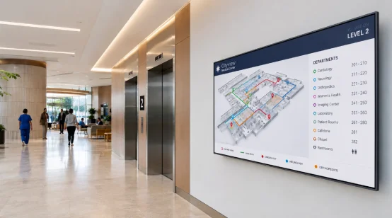
Why Do Hospitals and Banks Need Digital Wayfinding?
Entering an unknown facility prompts three immediate questions. Where am I right now? What is my exact destination? Which path gets me there? Delayed responses trigger intense anxiety. This proves especially true near a hospital emergency entrance or throughout peak banking hours.
Where Does Visitor Confusion Begin?
Navigating hospital routes demands multiple decisions. A patient might board an elevator first. Next, they traverse a connecting hallway. Finally, they pinpoint a specific numbered room. Inside a bank, choices differ. Patrons must determine if they should pull a queue number. Otherwise, they might wait at a counter or consult a relationship manager.
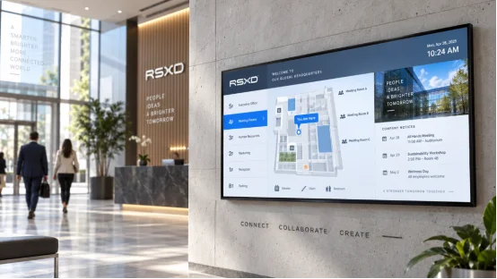
A digital directory immediately identifies the current floor. It highlights the building area, department name, and primary services. Guests easily search for a destination. Then, they trace a distinct route. Even lacking touch capability, these systems excel. Rotating floor maps and prominent directional arrows consistently deliver robust guidance.
Wall-mounted screens maximize vertical room. This preserves vital floor space. Crowds, luggage, or cleaning carts rarely block them.
Unlike tiny desktop monitors, wall-mounted digital signage features huge maps. It easily presents clear arrows, floor numbers, and multiple language guides. Inside a hospital waiting area, this exact screen shares department spots. It also highlights service hours and quick alerts.
A useful system does more than display a building map. It guides people from the entrance to the destination and confirms the route at important decision points.
The first screen should answer the location question quickly. Show the building name, current floor, entrance number, and main service areas. Organize information around visitor tasks, such as “Appointments,” “Payments,” “Imaging,” and “Pharmacy,” instead of using internal department language.
Banks can use categories such as “Account Opening,” “Loans,” “Business Services,” and “Cash Services.” Familiar wording helps visitors find the right area without learning the organization’s internal structure.
A route map should highlight elevators, stairs, corridors, turns, and color-coded zones. Each key point needs a short instruction, such as “Take the elevator to Level 3, then turn right.”
For a large hospital or office building, a QR code can let visitors send the route to their phones. The screen may also identify accessible entrances, restrooms, baby-care rooms, and waiting areas.
Departments move. Bank counters change. Corridors close for maintenance. Remote content management lets staff update multiple screens from one location instead of changing each device separately.
When an area becomes unavailable, the route can be replaced quickly. Real-time visitor information is also useful for queue notices, service interruptions, safety alerts, and altered opening hours.
The technology may be similar, but visitor needs are different. Hospital visitors may feel worried, be in a hurry, or travel with someone who has limited mobility. Bank customers usually care more about privacy, queue speed, and service separation.
Hospital screens should use calm layouts, high-contrast text, and large directional arrows. Routes work better when divided into short steps instead of showing a crowded map.
After entering an outpatient hall, a screen might first direct visitors to registration and payment. A second screen near the elevator can confirm the floor and department. Accessible wayfinding should show ramps, elevators, and step-free routes clearly.
Public screens should never expose patient names, appointment details, or other private information. General directions and service notices are enough.
Bank screens can show service zones, queue instructions, and estimated waiting information without displaying personal customer details.
For a multi-floor branch, a digital map can guide visitors to meeting rooms, business services, or loan consultation areas. A QR code lets customers keep the route on their phones, so they do not need to ask for directions repeatedly in the lobby.
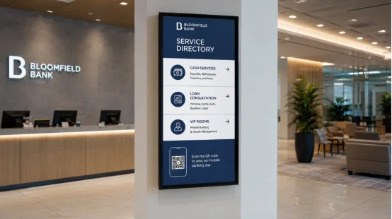
Start with the building and visitor journey, not just the screen size.
Entrances may need a wide horizontal map, while narrow corridors may suit a vertical display. Review viewing distance, ambient light, wall strength, power access, and cable routing before choosing hardware.
The enclosure should not project too far into a busy passage. This matters in hospitals where wheelchairs, beds, and service carts move through the same areas. A stable mounting structure and easy-to-clean surface also support daily use.
Decide who manages maps, department names, opening hours, and emergency messages. Templates should use consistent icons, colors, and terminology across every floor.
If the system connects with appointment, queue, or building-management software, updates can become faster. Even without integration, choose a player and management method that can support future changes.
Ask people who were not involved in the project to walk from the entrance to a destination. Watch where they stop, which arrows they miss, and whether they can identify their current position within a few seconds.
Test wheelchair routes, low-vision readability, and multilingual instructions. A real walk through the building often reveals problems that a meeting-room map review misses.
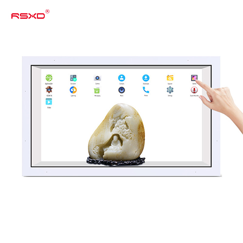
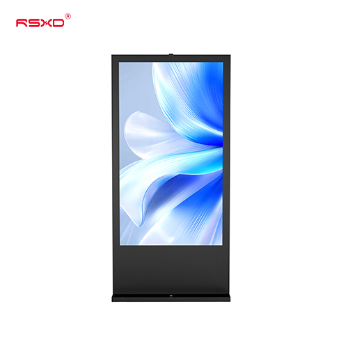
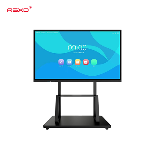
A standard monitor rarely suits every wall. Viewing distances and layout needs differ. RSXD develops adaptable display solutions. They fit your exact space and the visitor’s path.
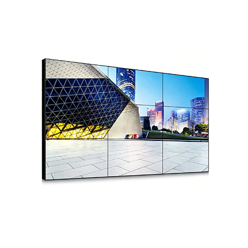
These wall-mounted signage options offer custom enclosures. You can mount them in portrait or landscape. The commercial-grade panels feature touch or standard operation. Plus, administrators manage content remotely.
Hospitals and banks leverage these tools. They seamlessly merge maps, directories, and QR codes. Queue data and temporary notices fit inside one unified system.
The core aim is straightforward. Visitors locate their next step fast. Meanwhile, staff update information easily, avoiding heavy maintenance burdens.
Q1: What Is Digital Wayfinding?
A: Digital wayfinding uses screens, maps, arrows, directories, and route instructions to guide visitors through large buildings.
Q2: Are Wall-Mounted Screens Better Than Floor Kiosks?
A: Wall-mounted screens save floor space and stay visible in busy entrances. Floor kiosks are useful when visitors need private, detailed searches.
Q3: Can Hospital Wayfinding Screens Show Temporary Changes?
A: Yes. Staff can update closed corridors, relocated departments, service hours, and emergency notices through remote content management.
Q4: How Do You Make Wayfinding More Accessible?
A: Use large high-contrast text, simple arrows, consistent colors, readable maps, and clearly marked elevator and ramp routes.
Q5: Do Banks Need Interactive Wayfinding Kiosks?
A: Not always. Touchscreens suit detailed service searches, while fixed directories and queue information may be enough for smaller branches.